
Why the smallest element in a digital product can have a big impact on the user experience.
When I first started working with UI design, buttons seemed like one of the simplest things to create. Choose a colour, pick a typeface, add some padding, adjust the corner radius, and make sure it fits nicely with the rest of the interface. But the more I worked with digital products, the more I realised that a button is doing much more than looking good. It is one of the main points where a user communicates with a product.
Think about a simple button that says “Buy Now.” Those two words create an expectation. I expect something to happen when I click it. Maybe the product will be added to my cart, or perhaps I will go directly to checkout. If I click it and nothing happens, I immediately start wondering whether the product received my action. I might click it again or leave the website.
That’s when I started looking at buttons differently. I no longer ask only, “Does it look good?” I also ask, “Will the user understand what happens when they press it?”
The words matter
One of the easiest things to overlook is the label. We often use familiar words such as “Submit”, “Continue” or “Next”, but familiar does not always mean clear. Now imagine completing a registration form and seeing “Submit.” Submit what? What happens next? Now compare it with “Create Account.” The second option immediately tells you what the action will do.
The same applies to an online shop. “Continue” is vague, while “Continue to Payment” gives the user a clearer expectation. The goal isn’t to make every button longer. It is to use words that match the user’s task. As designers, we already think carefully about typography and hierarchy. Product design adds another layer: language becomes part of the interface.
A button creates an expectation
Every button makes a small promise. If I see “Download PDF,” I expect a PDF to download. If I see “Save Changes,” I expect my changes to be saved. If I see “Delete Account,” I know the action is more serious.
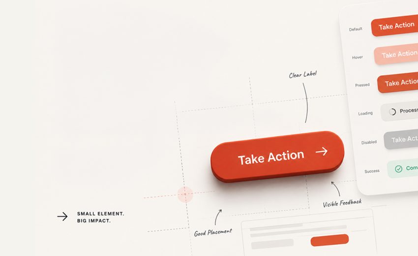
This is why the action, placement, and visual hierarchy need to work together. Imagine a settings page with Save Changes, Cancel, and Delete Account, all looking the same. The user has to figure out which action is important and which one is potentially dangerous.
Good hierarchy removes that extra thinking. The primary action should be clear, secondary actions should feel less dominant, and destructive actions should be treated carefully. This is an area where graphic designers already have a strong foundation. We understand that hierarchy tells people where to look first. In product design, that same hierarchy also influences what people do next.
A button is more than its default state
One of the biggest differences between designing a static graphic and designing a digital product is that an interactive element has to respond. A button might have default, hover, pressed, focus, disabled, and loading states. It may also need to communicate success or an error. For example, a “Pay Now” button. The user clicks it, but the payment takes a few seconds. If nothing changes, they may wonder whether the click worked and press the button again. A simple loading state such as “Processing…” tells them that the system received the action. That tiny piece of feedback can make a big difference.
I think this is one of the most interesting parts of product design: sometimes the most important part of a component isn’t how it looks when nothing is happening. It is how it behaves when something is happening.
Placement matters
A beautifully designed button can still create a poor experience if it is placed in the wrong position. Imagine a booking app where the user selects a destination, date, and time, but the “Search” button is difficult to find. Or a checkout page where “Continue Shopping” is more noticeable than “Pay Now.”
The problem isn’t the button itself. It is the relationship between the button and the user’s task. On mobile, this becomes even more important. People interact with their fingers, often using one hand, so size, spacing, and position all affect usability. A button that looks elegant on a large desktop screen might be frustrating to tap on a phone. The interface isn’t just being viewed. It is being used.
Don’t forget the risky actions
Some actions deserve more thought than others. Deleting an account, removing a project, or cancelling a subscription can have serious consequences. Think about “Save Changes” and “Delete Account” sitting next to each other with identical styling. The interface is technically functional, but it isn’t communicating the difference in consequences. A destructive action might need a different visual treatment, a confirmation step, or clearer supporting information. The goal is not to make users afraid to click. It is to make sure they understand what they are about to do. This is where product design goes beyond aesthetics. We have to think not only about the ideal journey, but also about mistakes and unexpected situations.
Design for real people
A button also needs to work for people with different abilities and different ways of using a product. Text needs to be readable, colour contrast needs to be strong, and focus states should be visible for keyboard users. Colour alone should not communicate whether an action is successful or has failed.
And then there is the physical side of interaction. A button on a phone is being tapped by a finger, not clicked with a precise mouse cursor. If buttons are too small or too close together, accidental taps become much more likely. These details may not be visible in a polished mockup, but they become very noticeable when someone actually uses the product.
What graphic designers can learn from a button?
For designers moving from graphic design into product design, buttons are a good example of how the discipline changes. The fundamentals are still there: typography, colour, spacing, contrast, alignment and hierarchy. But product design adds behaviour and responsibility.
A graphic designer might ask, “Does this button fit the visual identity?” A product designer also asks, “Is it clear? What happens after the click? What happens while the system is processing? What happens if something goes wrong? Can everyone use it comfortably?” That shift from appearance to behaviour is one of the biggest changes when moving into product design.
To conclude
It is interesting how much responsibility can sit inside such a small element. A button communicates an action, creates an expectation, guides the user, provides feedback, and sometimes protects them from making a serious mistake. After working with UI and product design, I have started to see buttons less as individual components and more as small conversations between people and technology. The button tells us what we can do. We interact with it. The product responds. Then the interface tells us what happened.
That’s why a button is never just a button.
It may take up only a small part of the screen, but it can make the difference between an experience that feels confusing and one that feels simple, clear, and trustworthy.
Brief to Final Design: Make AI Your Creative...