

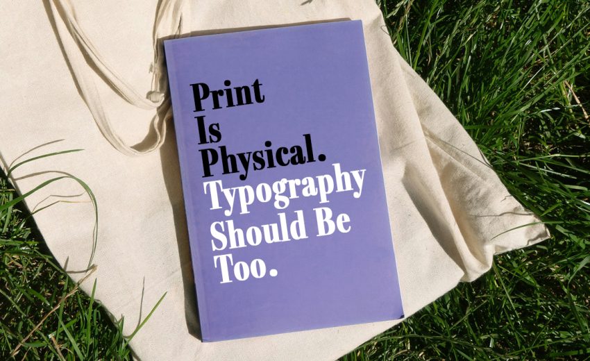
There is something different about seeing your design on paper. On a screen, I can zoom in, move things around, change the size, and keep adjusting until everything feels right. But once the design is printed, it becomes something physical. The size of the type feels different, the spacing becomes more noticeable, colours change, and suddenly the paper itself becomes part of the design.
Typography in print is not just selecting aesthetically pleasing font styles. It is possible for a font to look fine on the screen, but it may appear too tiny on a business card, too crammed into a brochure, and quite another when printed on textured paper. In other words, printing has its own scale, texture, and constraints, and the typography must be in harmony with them.
Consider a poster, for instance. The same headline will give completely different impressions based on its size, placement, and the amount of white space around it. In case the headline occupies almost the whole poster and touches the sides of the page, it will look impressive. In case it occupies only half of the poster with white space all around, it will still make an impression, but it will be much softer. And yet the words have not changed.
In other words, that is why I believe good print typography begins with an understanding of the physical object. A poster is viewed from some distance away. A business card is held in somebody’s hands. A brochure is looked through page by page. Packaging has bends and folds and shapes. Typography should react to these things.
Readability is another part that becomes much clearer when you see the actual print. Something that looks perfectly readable on a large monitor can feel surprisingly small on paper. A pale grey headline might look elegant on screen but lose its impact when printed. A tight paragraph may look neat digitally but become tiring to read in a magazine.
For me, one of the simplest and most useful habits is to print before you approve. It doesn’t need to be the final production print. Even a basic test can show problems that are almost impossible to notice on a screen. Hold it in your hands, step back, look at it in different light, and read it as if you were seeing it for the first time.
Typography also has a physical relationship with paper. A clean sans-serif might feel modern on smooth white stock, while a classic serif can feel completely different on thick, textured paper. Add embossing, foil, folding, or other finishing techniques, and typography can become something you don’t just see, you can actually experience it.
The more I work with print design, the more I see typography as part of the object itself. It is not simply information placed on a page. Its size, spacing, weight, contrast, and relationship with the material all contribute to how that object feels.
Digital design gives us flexibility. We can zoom, scroll, and resize almost endlessly. Print asks us to make decisions that have a physical consequence.
And perhaps that’s what makes print typography so interesting.
The screen shows us the design. Print lets us experience it.
June 22, 2026
A WordPress Commenter June 22, 2026
Hi, this is a comment.
To get started with moderating, editing, and deleting comments, please visit the Comments screen in the dashboard.
Commenter avatars come from Gravatar.